

ENG: “Finally 🧡”

ENG: “Finally an app with a dark theme” 👍
After going live 🎉
Orange Flex users are thrilled with the distinctive and elegant dark mode, which offers them expanded customization options within the application. Feedback from customers in Flex's Facebook group reflects their excitement. Happy users equal a delighted Flex team.
On the right - screenshots with comments from the Facebook group "Orange Flex - community".
Thank You
for watching
WCAG 2.0 checked
WCAG standards are met.
After ✅
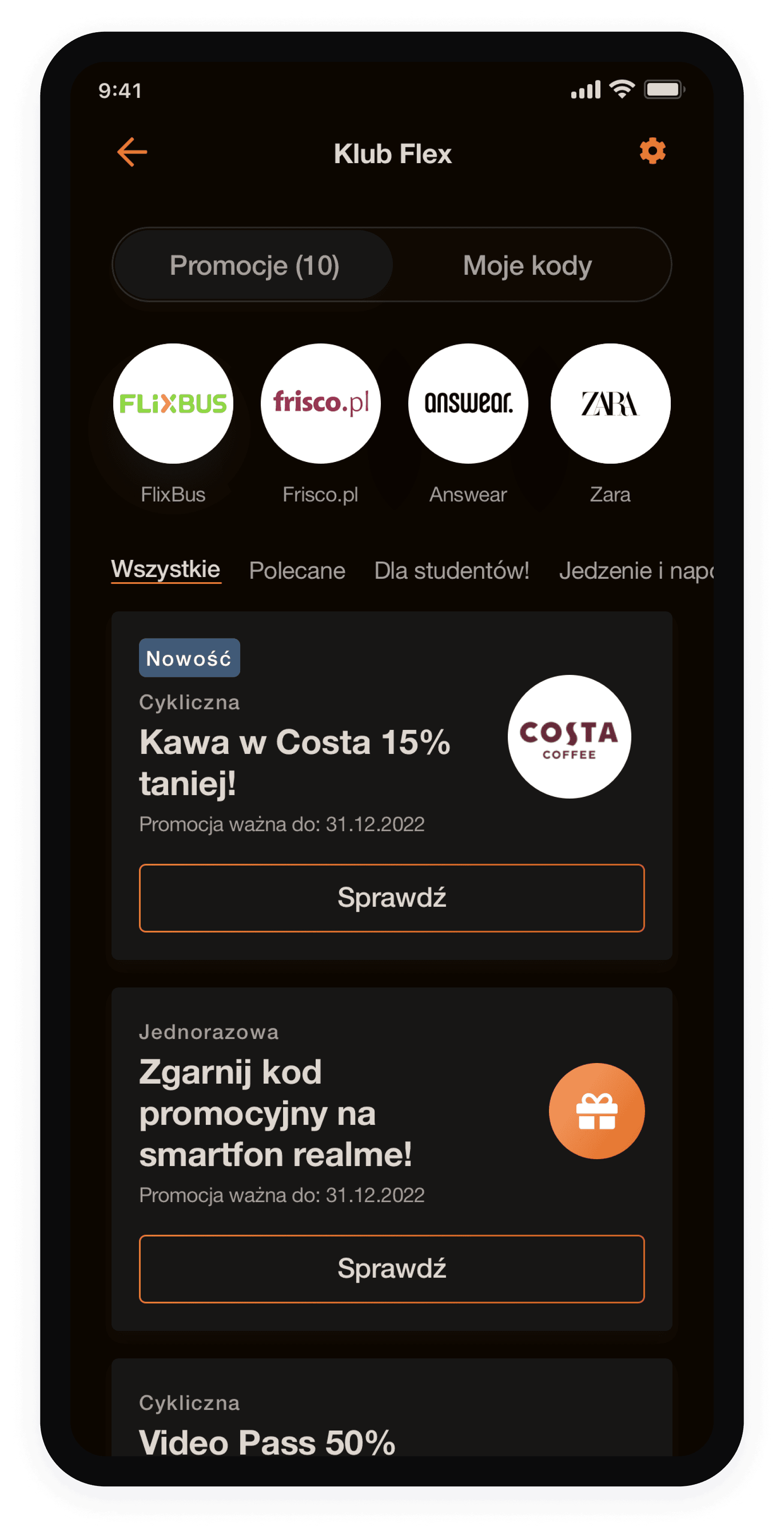
Before, partners' logos were displayed in a white square, so asset borders were not visible on white background of app and problem didn't exist.
After switching to dark mode, the sharp square edges with partner logos appeared unattractive and harsh. Therefore, I decided to:
Modify the component shape for partner logos from square to circle in the app code.
Prepare new requirements for logo assets:
· Logo assets will be created in a square shape but will be uploaded to a circular asset and automatically trimmed.
· Logos will be uploaded on white background. If not, then should be prepared as a asset with background in logo's color background, to fill the square with brand color.
One of the screens needed
some improvements
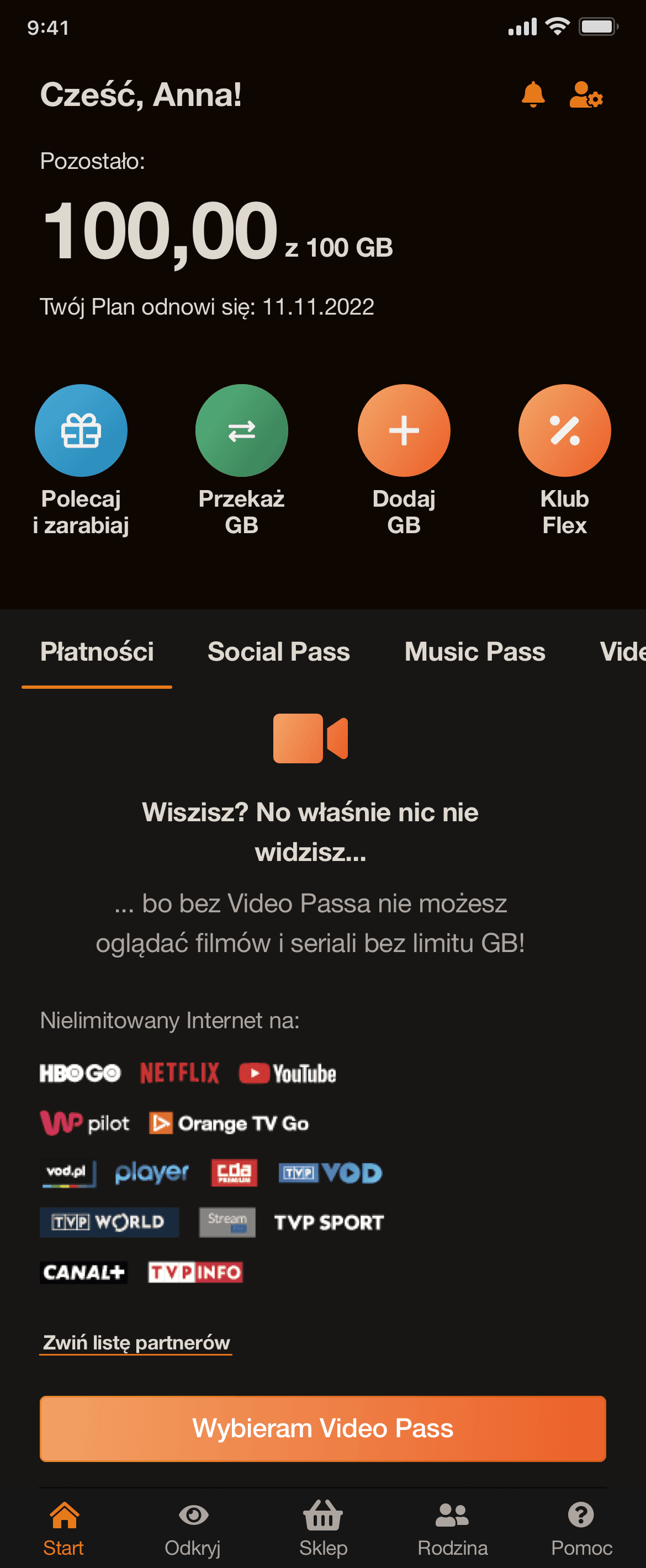
Video Pass screen
On the tabs with Video Pass, Game Pass, Music Pass, logos will be displayed
in inversion, as described in the customers' brand books. Some
of them, i.e. Netflix will remain unchanged.
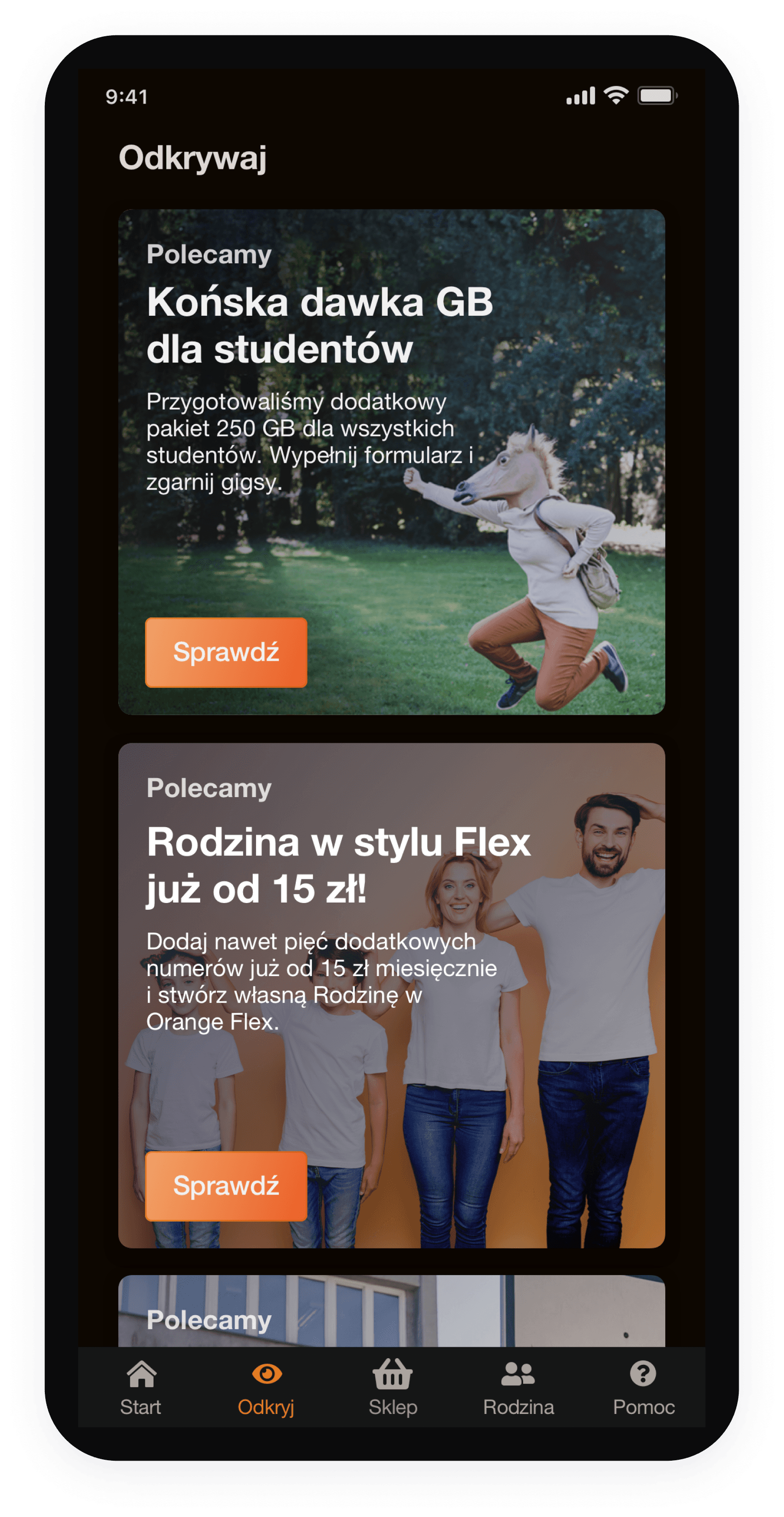
Discovery screen
After the changes, the banners' backgrounds look correct. The colors highlight nicely on a dark background. There is no need to change the approach in their design.
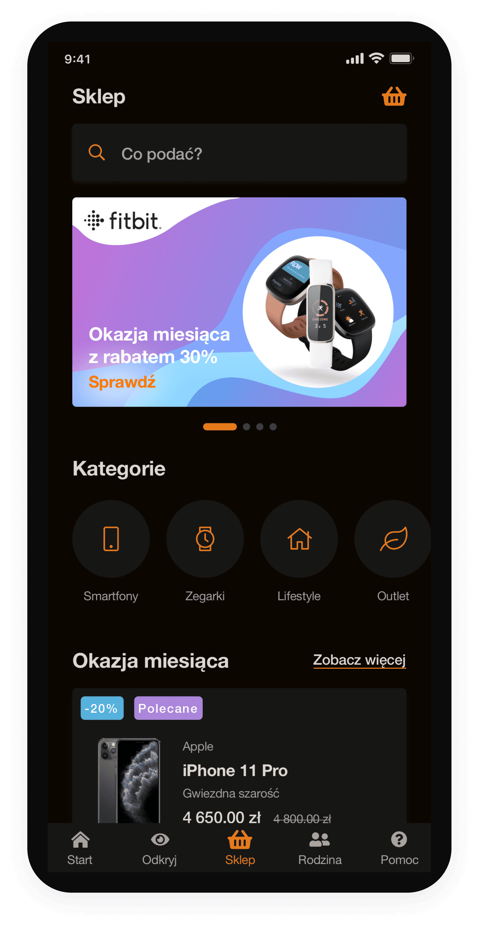
Eshop screen
Dark mode works in Eshop banners' favor. They are mostly designed in color, so it creates nice contrast, they are more clearer and emphasized.
Review how the new colors look on application components.
Screens
Where to find dark mode in the app?
You can find the dark mode switch here:
Dashboard ➡️ My profile ➡️ Application settings
To sum up, now we have 3 themes in the app:
👉 light
👉 dark
👉 system (the app theme adapts to the phone's native theme).

Dashboard
Advantages of using dark mode
👉 reduced exposure to glare and blue light
👉 battery life extension up to 30%, which means you won't need to charge your phone as often
👉 higher contrast = better exposed graphics, photos, thumbnails, icons etc.

Project process
Empower users to customize the app according to their preferences.
Create the design according to dark mode design principles.
Create an application consistent with the whole Orange Flex brand: colors, fonts, brand vibe.
Dark mode is the perfect complement to Flex's eco ad campaign. (Orange Flex has reduced their carbon footprint and is positioned as the only climate-friendly offer on the market. Dark mode is perceived as eco, because it reduces the need to charge batteries. 🌳)
Goals
The app lacks the option to switch from light mode to dark mode, which is a highly requested feature among Flex app users.
Problem
Company
Platform
My role
Industry
Tools used
Year
Project duration
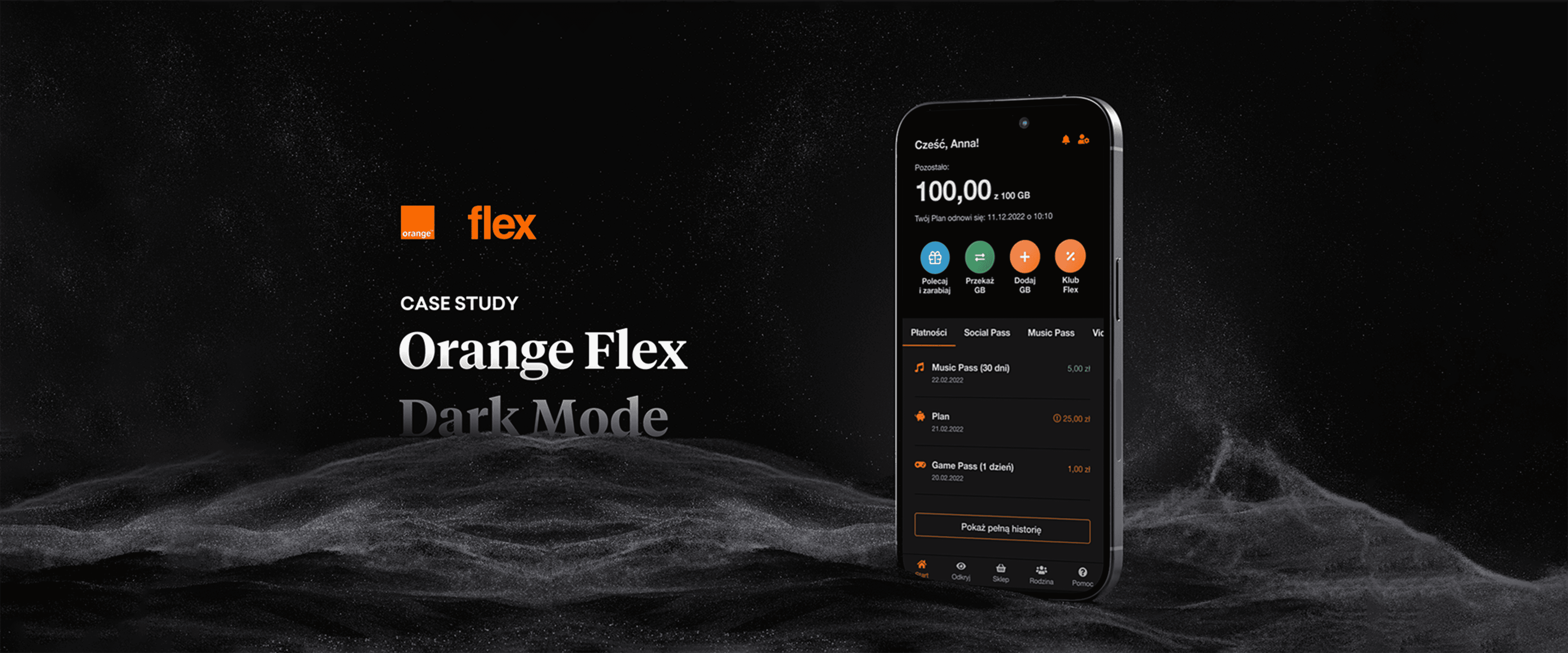
Orange Flex
Mobile app
UI / UX Designer
Telecommunications
Figma
2021
One week

Colors
👉 If the color was a shade of gray or black, I added 5% of the brand orange color to it, to create the feeling that dark mode colors are more branded. Thanks to that we can feel that colors are more consistent and they come from one family. Simple trick but makes huge difference.
👉 I subtracted -10% saturation from them, because placing the colors on a dark background gives the impression of bigger contrast (if contrast is too high it’s unpleasant for the eyes).
While creating colors for dark mode, I used the approach that colors can’t be as saturated as in light mode. So, when creating new ones, I based them on light mode colors, but:
